With the release of the Figma plugin API last year, the design team at Discord saw an exciting opportunity.
Around the same time as the Figma plugin beta, we were working hard on improving the accessibility of our dark and light themes. Neither theme was passing our accessibility bar and so we were working hard to address it.
In order to guarantee our new color mapping was working, we needed to design every new feature in both themes. Creating double of the design artifacts was time-consuming but necessary.
This is when the design tooling spark ignited. We asked ourselves “Could we build a tool to help us?” Spoiler alert we could, we did, and it rules. Since then, this question has become a critical part of our process.
For us, the benefits of design tooling are:
- Less time spent doing repetitive tasks and more time focusing on more important parts of our jobs.
- Preventing design debt.
- Improving the developer/designer handoff process.
- Fostering the design tooling community so people can build off of what we’ve started.
This post will cover:
- The problems we wanted to solve through design tooling.
- The methodology and thinking we used while creating these tools.
- How you and your design team can utilize these tools today (yay for open source)!
Saving time by automating the grunt work
Design tooling can automate the menial and repetitive tasks you do dozens of times a day. Replacing copy in multiple text fields at the same time, selecting all instances of a layer, or in our case creating two versions of every design.
Earlier I mentioned how we needed to create a light and dark theme version of every design we made. This type of work was precisely the type of work we could solve with our own design tool.
Enter Auto Theme
Auto Theme is a Figma plugin we created to automatically theme designs.
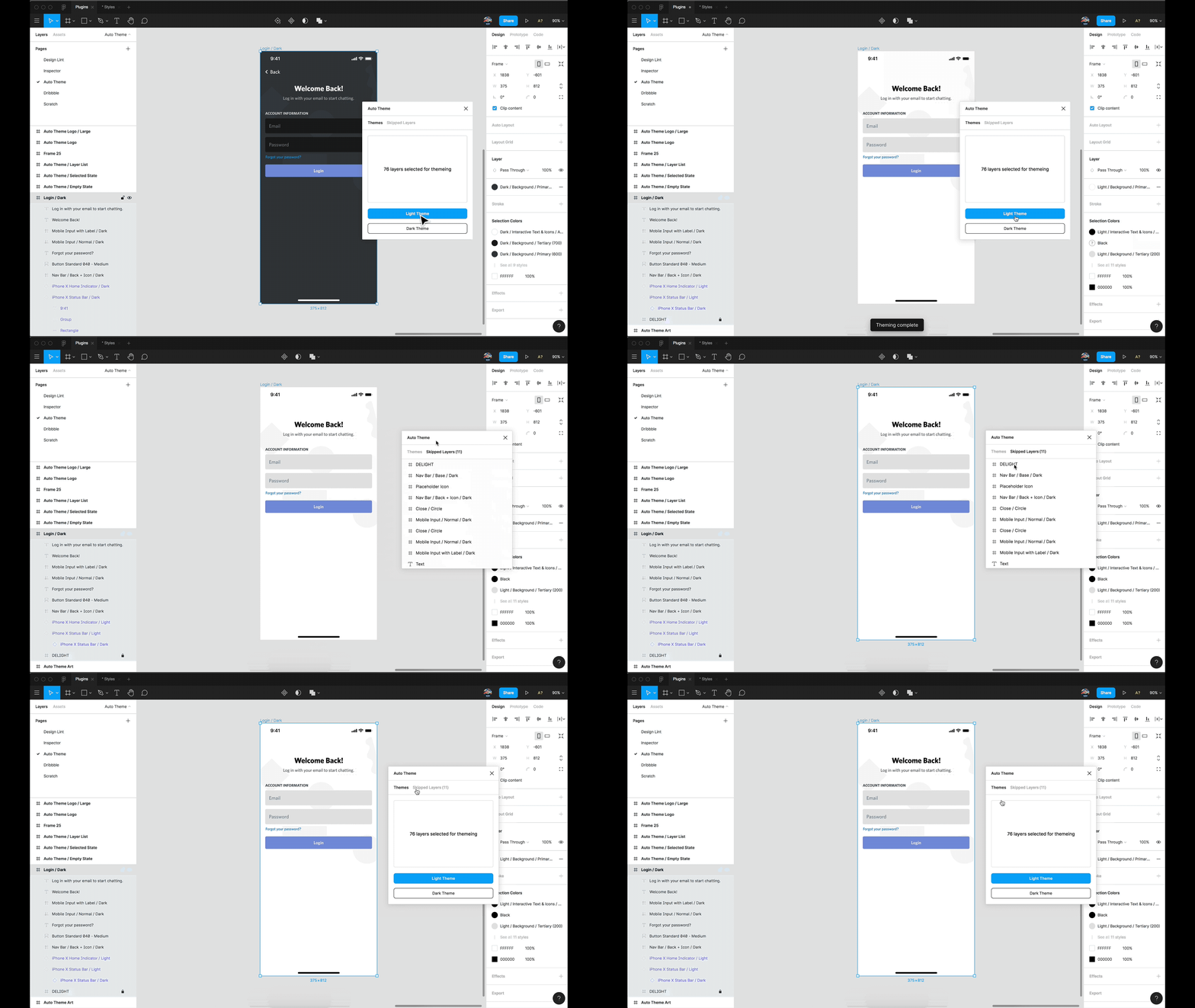
Instead of having to manually switch each layer and color to its light theme counterpart, we instead just had to run this tool. This made validating designs in both themes substantially less effort.
For instance, I recently worked on improving our mobile onboarding experience and wanted to make sure we were providing a great experience on both themes. Auto-theme made this significantly easier.
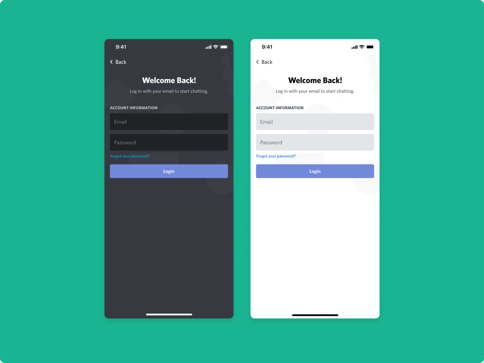
It works by looping over each layer you have selected in your design. From there, the plugin determines how to style a color depending on what type of layer it is. Is it text? Well then use this heading primary color. This layer is a shape? Well, use this primary background color instead.
What color a layer should swap to is determined by the user. In our instance, we set this up once, and now it works out of the box for our entire team.
In cases where the tool doesn’t know what to do (say it runs into an illustration), it flags it and shows it to you in a list of layers that were skipped. Although we built this tool, it’s just one of many plugins we use to help automate tasks in our day-to-day.
Preventing design debt and improving the designer to developer handoff with our design linter
I’m sure most designers have heard the question “is this ready for development?”.

Designers aren’t perfect, mistakes will happen, and that’s OK. This is especially true when you’re designing a flow across several screens.
Enter Design Lint
Design Lint is a Figma plugin for linting your designs.
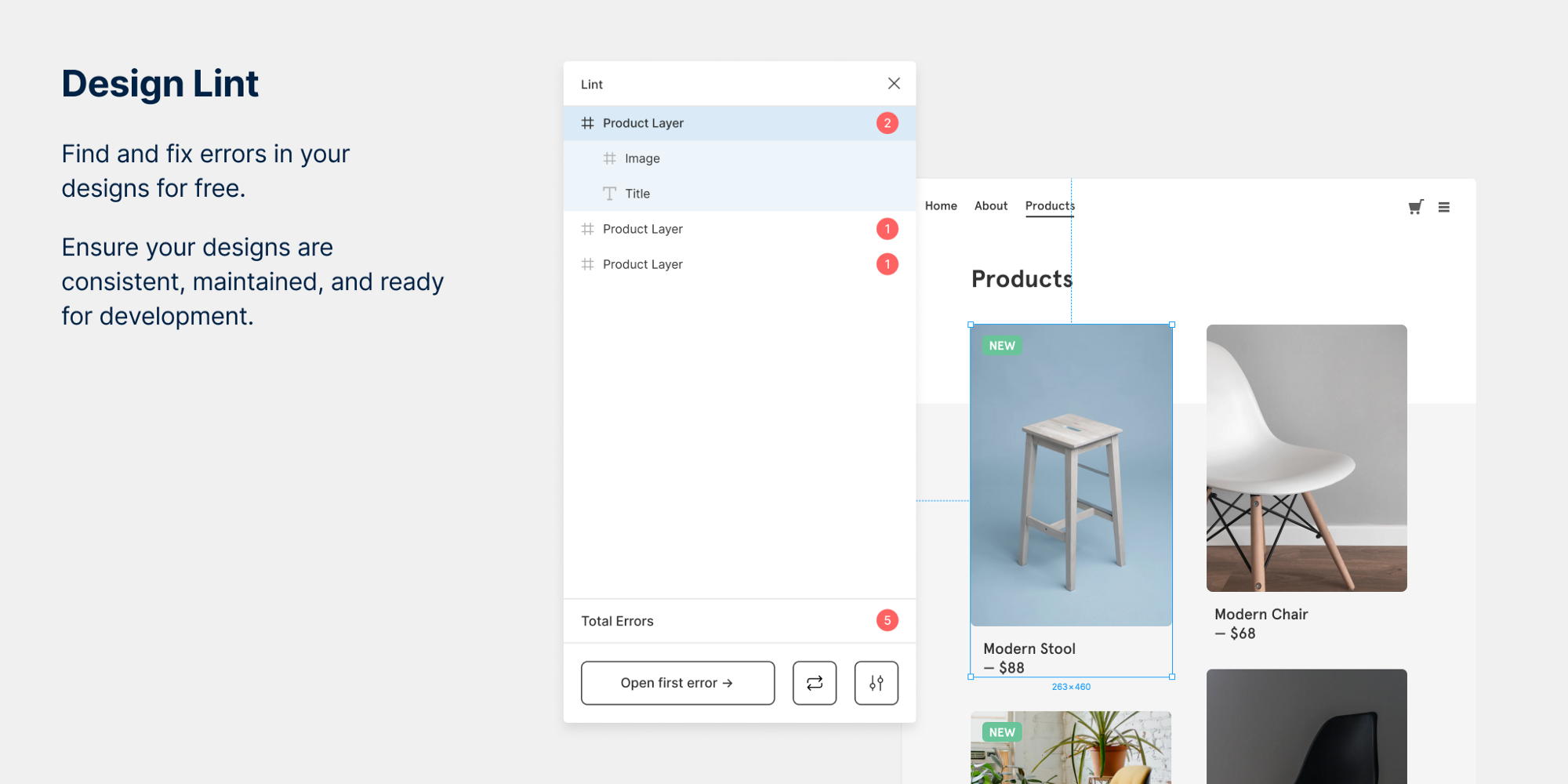
Our approach to solving the “is this ready for development? / will the next designer to visit this file will want to scream” problem is a tool for helping you find the errors in your designs.
Linting is common practice in programming that helps find errors and helps keep code consistent. We thought, why should design files be any different?
Design Lint checks your design to see where it’s missing styles (Figma’s name for design tokens/variables). Are you using typography that isn’t found in your design system? Are you using a border-radius that doesn’t match your standard? Is that new shade of black actually not a variable the developer has? Design Lint flags these issues for you.
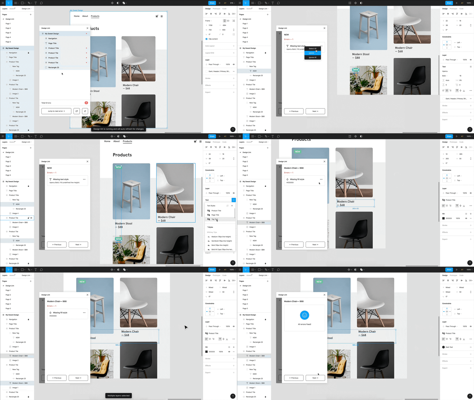
Designs often consist of hundreds to thousands of layers at a time. This tool finds mistakes for us so we can fix them before we start working with a developer on implementation. This also saves the developer time from having to ask a question if a mistake was an intentional choice or not.
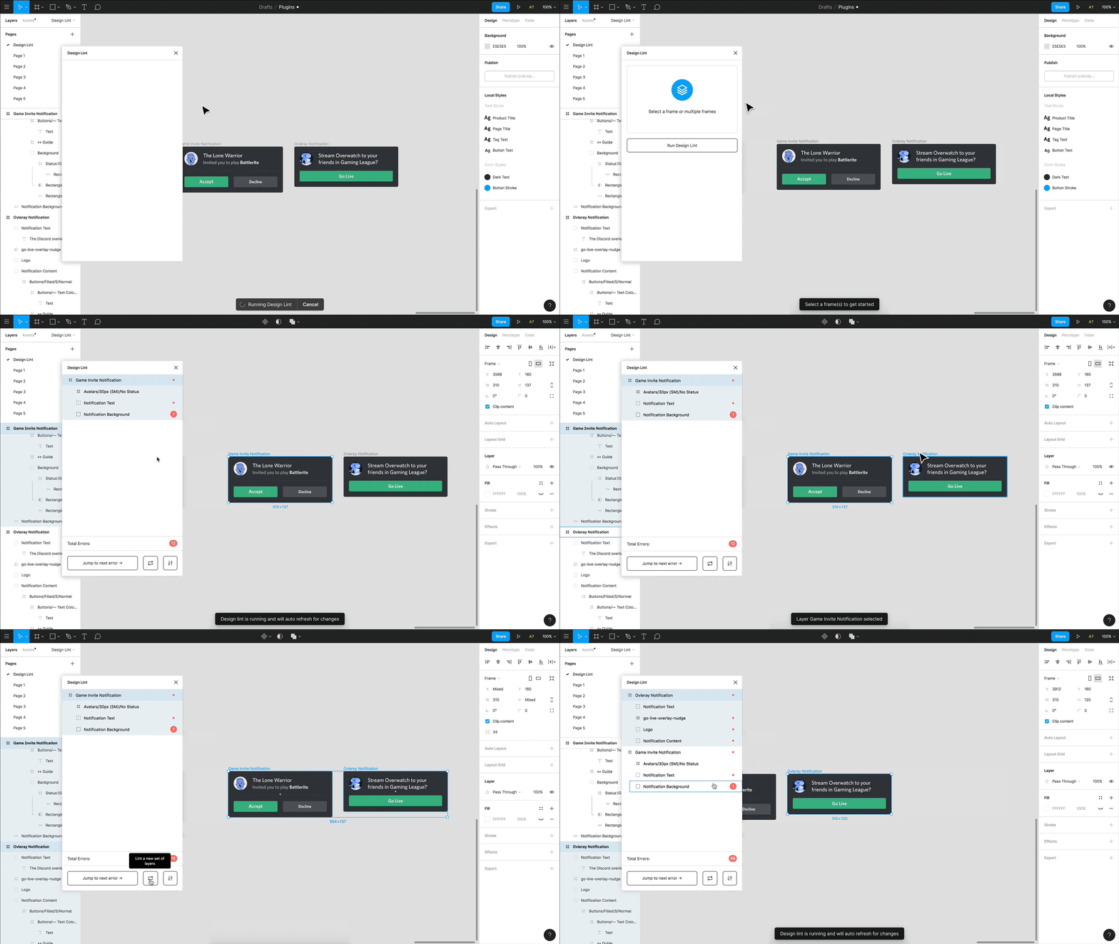
When running design lint over our entire design system, we can find errors before they propagate out to every file. We built this tool to work straight out of the box for everyone, but since it’s open-source, you can create custom linting rules for your team.
Making our files easier to navigate for everyone at Discord
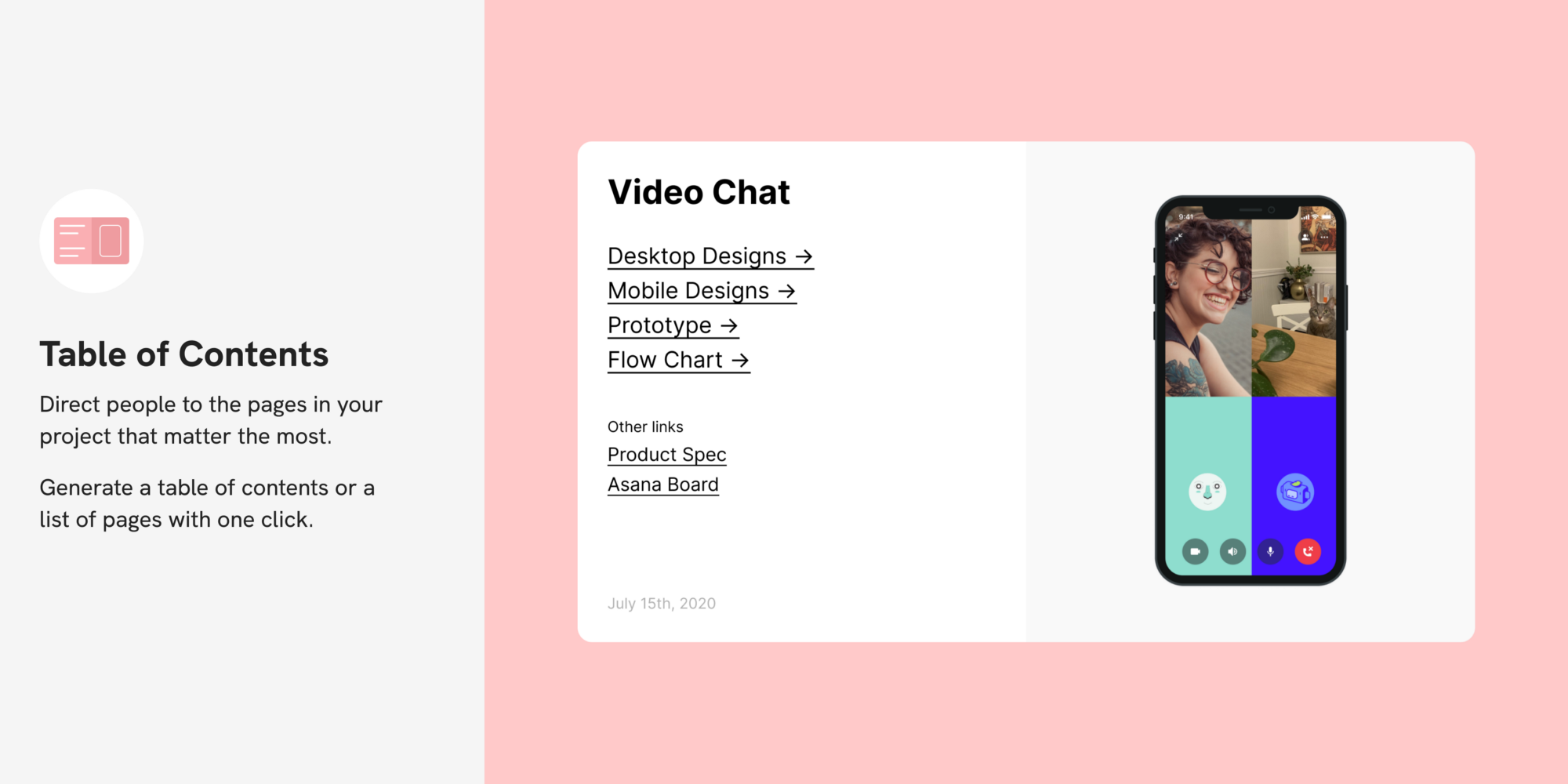
An issue we’ve run into as a product team is that Figma isn’t easy to navigate. In order to address this, we created a plugin called Table of Contents.
Enter our Table of Contents plugin
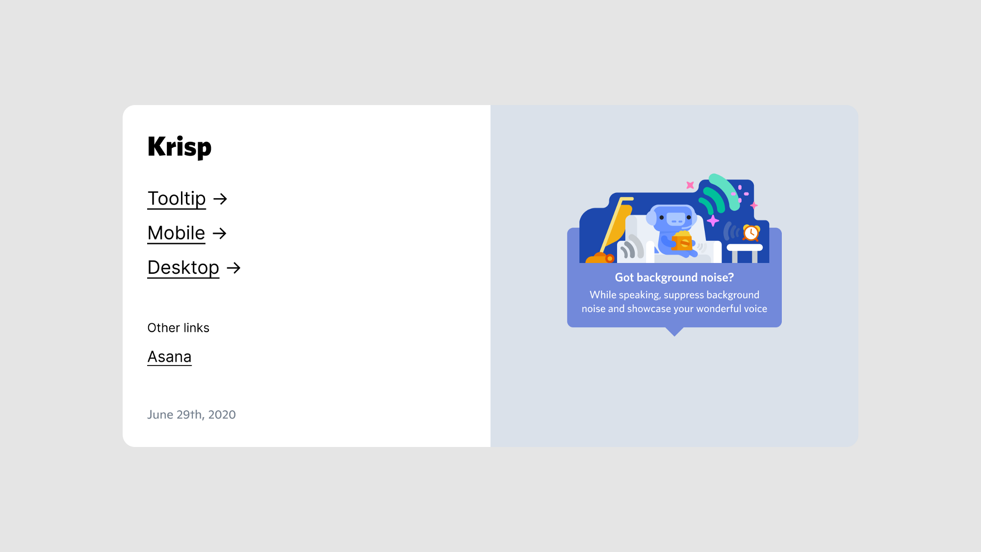
This plugin automatically generates a cover page called “Table of Contents”. On that page, we generate a frame with a list of all the pages in the file, placeholder links (that can be used to link to related materials), and a date.
Not being able to find specific designs, especially in larger projects, was a common problem for people outside of the design team. This plugin aimed to address the “where can I find that design?” problem.
Table of Contents is open source, can be customized to use your companies fonts, and is also available as a Figma template.
Building a meta-plugin to speed up tooling development
In order to make maintaining and building new tools easier, we built a tool to help us. “A tool to build tools” you could say.
Enter our Inspector plugin
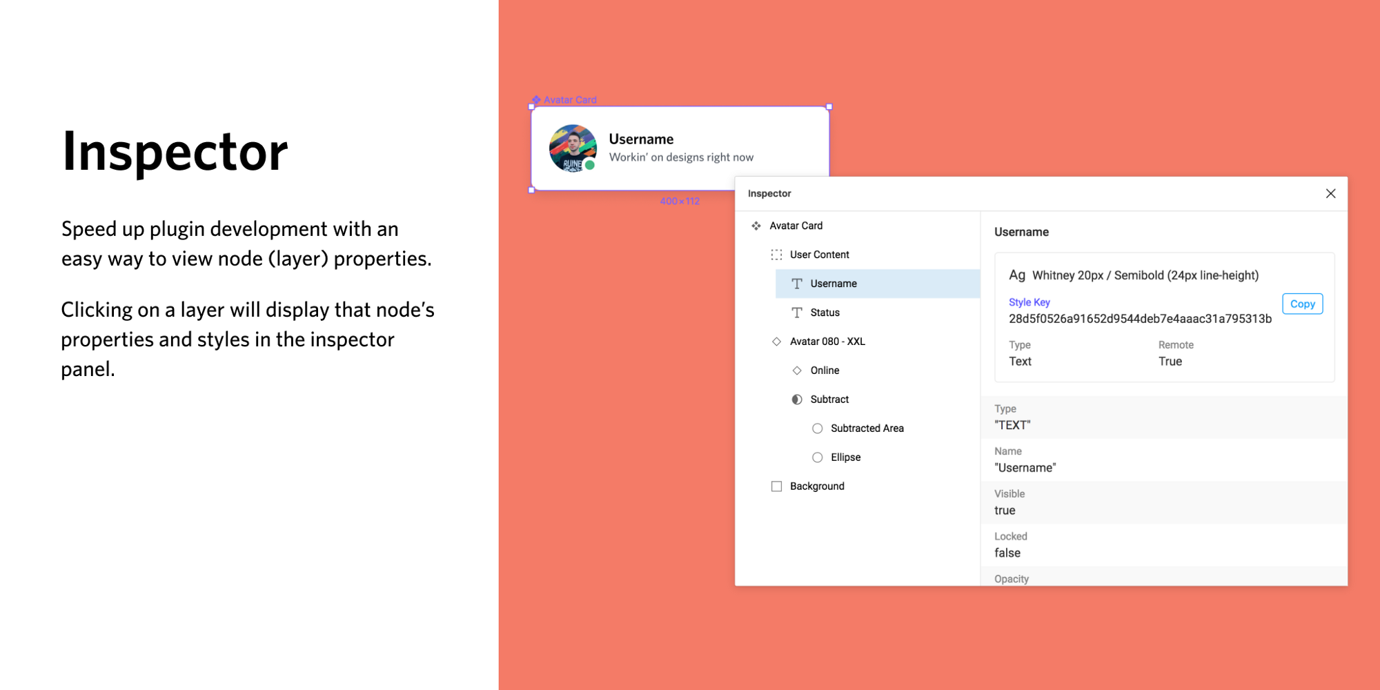
Inspector is pretty straightforward in what it does but slightly complicated to explain.
Every layer in Figma contains important meta-information. Its name, ID, whether it has children (little circle and little polygon, they’re so well behaved), what type of layer it is (text, image, shape), and more.
Inspector displays this meta-information for the layers you have selected. Think of it like chrome developer-tools, but for Figma designs. We also use this plugin to help update Auto Theme colors when a new color is added.
Making these tools available to everyone
At Discord, we believe in open source. Both our engineering team and design team utilize open source libraries, frameworks, and resources often.
We want your team to share the same benefits we’ve experienced from building and adopting these tools into our workflow. This is why everything I’ve mentioned in this post is free and open for your team to use.
Each tool was made with the Figma design system in-mind. Each plugin should just feel like an extension of the interface you’re already used to.
A few of these plugins can be installed straight from the Figma plugin page. However, we’ve still made them open source in case you want to make them more specific for your team.
Auto Theme - Github
Design Lint - Figma plugin page or Github
Inspector - Figma plugin page or Github
Table of Contents - Figma plugin page or Github
Discord Project Scaffold - Github
You can also view all of our open source design files at figma.com/@discord.
As a team, we’re excited to see how design tooling will grow. Will we see code formatters like prettier.js but for designs? Will we see a design version of npm or yarn? Live type checking while designing with design tokens?
These ideas may all be constrained by thinking too close to existing development tools, but we believe this is just the beginning of a larger movement of how we work as designers.
We’re excited to see what the community builds from here and hope you find the tools we’ve made helpful for your team.
If you’d like to come to design cool things with us, check out our jobs page, we’re hiring!


_Blog_Banner_Static_Final_1800x720.png)


_MKT_01_Blog%20Banner_Full.jpg)


.png)


.png)


