


When Discord first started as a desktop app, the fastest way to make Discord available on Android and iOS involved copying the desktop app’s existing navigation patterns.
.png)
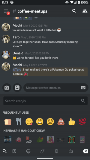
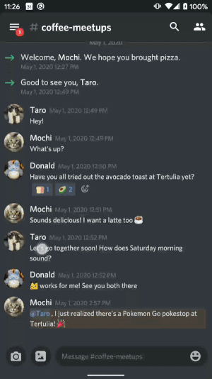
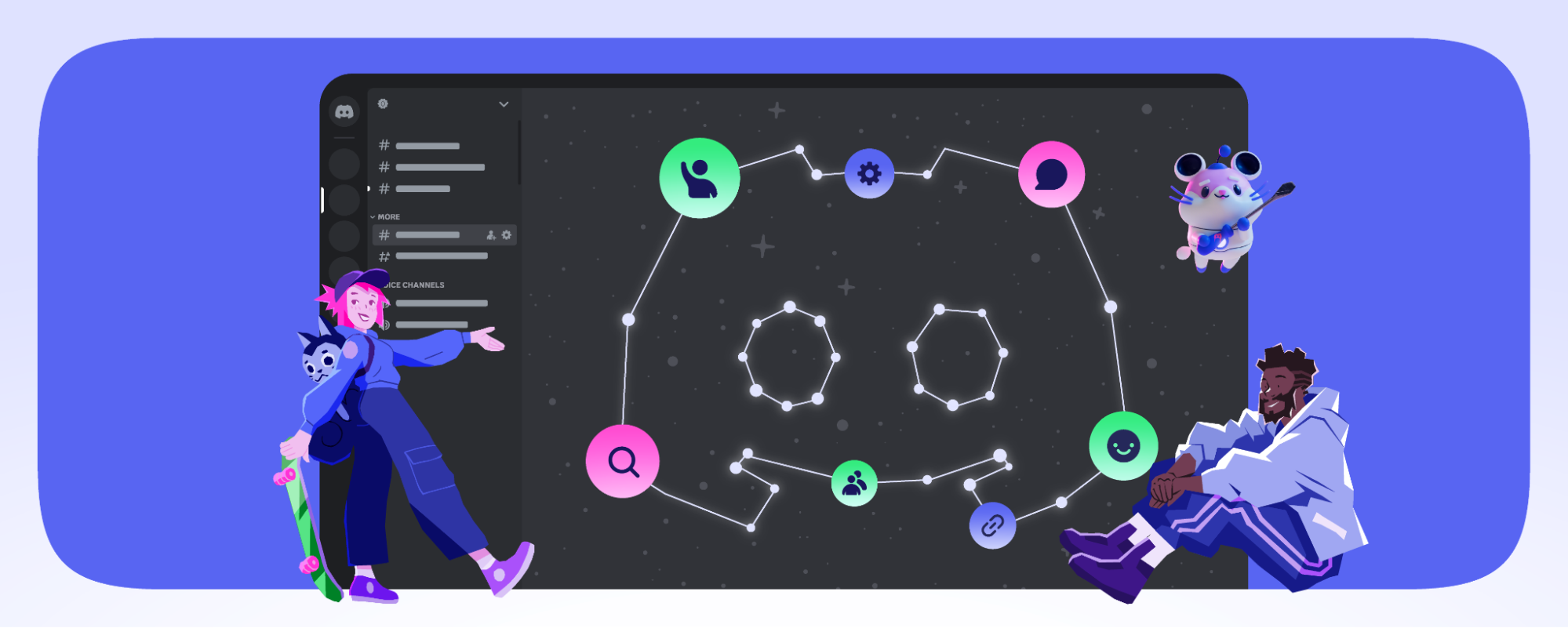
Mobile users switched between core features using a navigation drawer which allowed the mobile apps to mostly replicate the desktop app’s UI. While the old navigation UI served early Discord users well, we realized over time that our mobile in-app navigation for accessing core features like the Quick Switcher had become unintuitive and hard to discover for new users. We needed a navigation UI that made primary features easier for new users to discover while making secondary features still available to existing users.
To make Discord’s primary features more understandable, we recently launched the new Tabs product in our Android app! We found this project exciting to tackle, because in addition to making the app easier to navigate, this project presented a series of technical challenges that led us to build a custom bottom tabs navigation implementation and a panels-based replacement for Android’s stock navigation drawer.
Why Tabs ?
Before we dive into the technical details, let’s review why we built the Tabs product which includes both the bottom tabs and the panels navigation. We built Tabs to improve the Discord mobile experience in three ways:
1) Unlock surface area for future products. We’re currently exploring product ideas, like features to help users discover and join communities of interest, that we’d like to surface in Tabs. While drawers optimized the app for current features, they provided too many constraints for future top level mobile features.
2) Familiar mobile navigation paradigm. Modern Android and iOS apps commonly use bottom tabs navigation to make their core features easy to understand.
3) UX benefits.
Conversations in Discord happen in many places, and Tabs helps users navigate to those conversations. With the new horizontal panel gestures in Tabs, users can access servers, channels, and Direct Messages more easily now! Additionally, panel gestures allow users to now peek at new activity in the servers list.
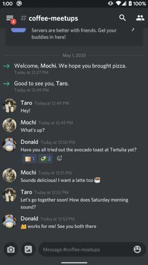
Tabs more prominently surfaces powerful features like the Quick Switcher which also helps users get to conversations more quickly.
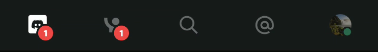
Tabs helps users stay on top of unread mentions and incoming friend requests via notification badges on the Home tab and on the Friends tab.
Unlike Android’s standard drawers whose gestures conflict with Android 10’s system back gestures, our mobile apps’ panels are easier to swipe because they support horizontal swipes from most areas on the screen.
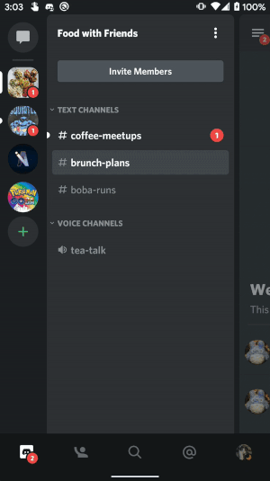
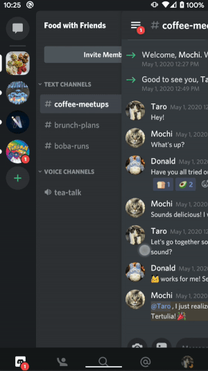
From a design systems perspective, we wanted the app to have only one primary navigation component: the bottom tabs. Keeping the drawer with bottom tabs violated Material Design guidelines that suggested not using drawers and bottom tabs together. They were both primary navigation components which made the information hierarchy ambiguous when used together. Because the drawers overlaid the channels list on top of the bottom tabs, the drawers didn’t clearly indicate how users should get to the Chat feature from a non-Home tab. By replacing drawers with panels, we repositioned the channels list to make the UI correctly represent the “Home -> Channels -> Chat” hierarchy. With this change, the bottom tabs more clearly represented the primary navigation hierarchy, while the panels represented a secondary navigation hierarchy within the Home tab.
Building Bottom Tabs Navigation
When we started building Tabs for Discord Android, we looked forward to trying out Android’s BottomNavigationView along with the AndroidX Navigation component . On paper, both of these frameworks seemed like solutions that would make building Tabs much easier. In reality, we discovered that both of these frameworks had limitations that prevented us from delivering a delightful and responsive UI to our users.
For the bottom tabs, we aimed to create a visually delightful experience by showing the user’s avatar and presence indicator for the User Settings tab. This required our bottom tabs to support custom views in addition to standard icons. Right off the bat, BottomNavigationView’s limited API, which used standard icons from an Android menu resource, could not support the complex icon behaviors we hoped to deliver. Although BottomNavigationView supported adding custom child views programmatically, it didn’t offer default APIs for more complex icon behaviors like setting alpha values to indicate selection state (e.g. for the user avatar). It also didn’t automatically support showing the custom child view in Android Studio layout previews which we depended on to help us develop the UI quickly. Instead of using BottomNavigationView, we built a simple custom solution with a horizontal LinearLayout where the child ImageViews and custom views represented each tab. Our custom solution supported complex icon behaviors and Android Studio layout previews.
For tabs navigation, we initially tried out the AndroidX Navigation component because we liked the simplicity of its Navigator and Navigation Graph APIs. Unfortunately, when we started building tabs navigation, the AndroidX Navigation component had a major limitation: because the default Navigation component created a new fragment on each tab selection, navigating between tabs felt slow. In order to make tab selection fast, we searched for ways to keep fragments in memory (e.g. creating a custom Navigator component and using the Android Architecture Component sample extension methods), but ultimately we couldn’t find a satisfactory solution.
The custom Navigator component required too much risk for us because the proposed solutions involved completely overriding the parent method, FragmentNavigator#navigate(), without ever calling the super method. That meant that updates to FragmentNavigator and other parts of the Navigation component could easily break our implementation.
For the second solution, the sample extension methods applied specifically to Android’s BottomNavigationView, and the methods managed the lifecycle of the tab fragments. Because we had to use a custom view for our bottom tabs, reusing the logic in those extension methods would’ve required writing a custom solution anyway.
Since neither of the two solutions above made building responsive tab selection easier, we decided to go with a simple custom tabs solution without using the Navigation component: keeping all fragment tabs in memory inside a host fragment. To enable fast tab selection, we simply toggled the visibility of the tab fragments without needing to create a new fragment each time a user selected a tab.
To help us avoid wasting network requests, we made each tab fragment aware of the tab selection state. The Recent Mentions tab, for example, uses this state to only fetch mentions from the network when it is the selected tab.
Opening the Door to Better UX with Panels
In an early iteration of Discord Tabs, we tried combining the drawers UI and bottom tabs UI together. We knew we couldn’t ship tabs with drawers because it created two simultaneous primary navigation components, but we appreciated DrawerLayout’s default animations and ease-of-use. To replace DrawerLayout, we aimed to build a custom view called OverlappingPanelsLayout with equally polished animations and easy-to-use APIs. We initially experimented with physics-based fling animations. Although they supported fast animations for high-velocity gestures, they made the animations slow for the average low-velocity fling gesture. We couldn’t increase the minimum fling velocity because it would have made the panels too hard to open. Instead of using the physics-based animations, we eventually decided to adopt the easing interpolators and fixed durations recommended by Material Design guidelines. Following these guidelines made opening and closing panels feel responsive and fast.
To make the OverlappingPanelsLayout API easy to use, we made the custom view a FrameLayout that expected exactly three child views. The child views represented the left, center, and right panels. In our code, we provided the child views by nesting them in OverlappingPanelsLayout via XML.
In addition to supporting polished animations and easy-to-use APIs, building a custom view allowed us to create flexible click handling and swipe handling. Unlike DrawerLayout which only supported drag-open gestures from the edge of the screen, OverlappingPanelsLayout offered multiple gestures to easily open side panels: horizontal swipes on most areas of the screen and also clicks on the closed center panel.
With its features and flexible APIs, OverlappingPanelsLayout evolved into an excellent replacement for DrawerLayout. Before we reached that end state, however, we had to first overcome numerous technical challenges like building custom panel gesture detection, allowing horizontal scrolls in child views, and maintaining panel states through device rotations.
Building Custom Panel Gesture Detection
First, we tried to support dragging the center panel. This Stack Overflow post gave us a sense of how to move the center panel in response to drag gestures. However, copying that code into the onTouchEvent method of OverlappingPanelsLayout didn’t work initially. The child views of OverlappingPanelsLayout handled their own touch events like clicks and vertical scrolls, so the OverlappingPanelsLayout ViewGroup did not initially handle those touch events. Fortunately, Google searches led us to the Android developer documentation for managing touch events in ViewGroups.
Based on the lessons from those Android developer docs, we decided to handle fling and drag gestures in OverlappingPanelsLayout using Android’s onInterceptTouchEvent and onTouchEvent APIs. onInterceptTouchEvent decides when the OverlappingPanelsLayout ViewGroup should handle the touch event versus when it should allow child views to handle touch events. OverlappingPanelsLayout handles most horizontal scrolls while allowing its child views to handle vertical scrolls (e.g. for vertically scrolling the chat list or the channels list). This example code from our OverlappingPanelsLayout class demonstrates how we detect dragging and flinging.
First, we detect horizontal scrolls by checking that the difference between x values is greater than the distance between y values. Then we intercept those horizontal scroll MotionEvents, so onTouchEvent can handle them. onTouchEvent handles ACTION_MOVE events by dragging the panel, and it handles ACTION_UP events by snapping the center panel to a closed or opened state. Using the gesture velocity measured by the VelocityTracker, snapOpenOrClose either snaps the center panel to the nearest edge for slow gestures or flings the center panel in the direction of the gesture if the velocity exceeds the minimum fling velocity.
Allowing Horizontal Scrolls in Child Views
Before we launched the bottom tabs and panels UI to the public, we asked members of the Discord Testers server to help us catch bugs. Discord Testers quickly identified a bug where users could no longer horizontally scroll the emoji category selector in the chat input with the panels UI.
We wanted the panels to continue to handle all horizontal swipe gestures as a default behavior. Therefore our bug fix for the emoji category selector bug had to involve a new API that would allow the app to selectively register child gesture regions where the panels should not handle swipes. To disable panel gestures on selected child views, we created a class called PanelsChildGestureRegionObserver which helped detect child gesture regions and notify OverlappingPanelsLayout about those gesture regions.
In this example code for registering child gesture regions, ChatInputFragment is a child of OverlappingPanelsLayout. The parent fragment containing OverlappingPanelsLayout, PanelsFragment, listens to the gesture region updates and passes the updates on to OverlappingPanelsLayout via setChildGestureRegions. OverlappingPanelsLayout then knows to not handle horizontal scrolls in those regions. By keeping OverlappingPanelsLayout unaware of which features have child gesture regions, this API makes it easy to disable panel gestures on multiple child views including other use cases like Discord’s push-to-talk button in the center panel which requires holding down the button without shifting the panel.
Maintaining Panel States Through Device Rotations
Like other modern Android apps, Discord’s Android app aims to maintain view state through device rotations. We initially thought the AndroidX ViewModel architecture component would fully solve the problem of maintaining panel states through rotations. When the OverlappingPanelsLayout view’s parent fragment resumed after a device rotation, the fragment retrieved the pre-rotation panel state from its corresponding view model and tried to update the state on the recreated OverlappingPanelsLayout view. Unfortunately, this initially simple solution caused the app to crash after device rotations. The view model correctly stored state through device rotations, but our app tried to apply the state update to OverlappingPanelsLayout too early. We found that when the fragment tried to apply this update after the rotation, the child view, OverlappingPanelsLayout, had not finished its layout pass in the view drawing process yet. OverlappingPanelsLayout assigned its panel references from the child views inside onLayout, so it couldn’t apply panel state changes until after onLayout. To address the constraint posed by the layout pass occurring after the panel state update, we captured the pre-layout update as a Kotlin lambda called pendingUpdate. We then invoked the pendingUpdate inside onLayout after setting the child panel references. We considered creating a queue of pending updates. However, we realized only the latest state update mattered in our panels use case, so we stuck with the simple solution of saving a single pending update rather than a queue of updates. We’ve shared example code for applying pending view updates here.
Continuously Improving Apps and Delighting Users
As more app developers update drawer-navigation-based apps to deal with Android 10’s conflicting system back gesture navigation, we hope Discord’s lessons from building bottom tabs and panels will help you all create delightful and easy-to-navigate UI! We open sourced our panels library in our new Overlapping Panels GitHub repository, and we included a sample app to help you get started. Feel free to try out Overlapping Panels in your apps, and let us know how it goes!
Discord’s product & engineering teams are constantly working on making our apps helpful and delightful across all of our supported clients: Android, iOS, Desktop, and Web. If you’re interested in helping us bring people together on Discord by building product features or improving infrastructure, let us know by applying to our job openings here!


.png)
.png)


Nameplates_BlogBanner_AB_FINAL_V1.png)

_Blog_Banner_Static_Final_1800x720.png)


_MKT_01_Blog%20Banner_Full.jpg)


.png)


