


We believe that Discord is for everyone — which is why we’ve been hard at work this year to improve the accessibility of our apps across the board. We still have plenty more to go, but we thought we’d share part of the story of one of our recent projects: Keyboard Navigation in the desktop app.
This kind of work benefits all kinds of users. It enables those who can’t comfortably use a mouse to access everything in the app, assists screen reader users in understanding and interacting with Discord effectively, and provides power users with even more shortcuts and opportunities to work as efficiently as possible. As a relatively small team, projects like this let us have a big impact and raise the bar for everyone in one go.
Keen users may realize Discord has already supported some keyboard usage in small parts of the app for years. Existing keyboard shortcuts allow you to move between channels, take you through input fields in forms, and quickly access things like Search and the Quick Switcher. The goal of our project was to expand keyboard support beyond just specific shortcuts to *everything*, making Keyboard Navigation a truly first-class experience.
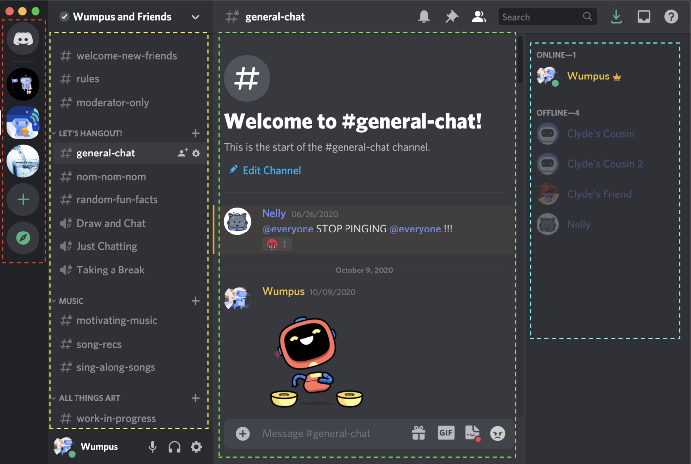
the Member List.
A number of design and engineering challenges stood in our way, but one was particularly difficult and was seemingly unanswered by modern browsers or other projects in the space: how do we consistently indicate where focus is on the page?
That may sound like a simple and well-explored problem at a glance — we assumed it would be as well! As time went on, we quickly realized just how many unsolved complications and constraints ruled out all existing options we could find.
The Problem
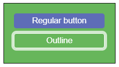
If you’ve experimented with creating focus styles with CSS before, you’re probably familiar with the two primary options that browsers currently provide: the :focus selector and the outline property. These two options are how browsers tend to implement their default focus styles, but if you want consistency between different browsers or have a design specification to adhere to, it’s likely that you’ve added a rule like this somewhere in your styles:
:focus {
outline: 3px solid deepskyblue;
}
This single rule should be enough to handle any element that has focus on the page and render a consistent, hopefully-visible ring around it. But, especially when integrating into a larger codebase, things start to fall apart fast.
Things like clipped outlines in overflow-hidden containers, mismatched radiuses on rounded shapes, and strangely positioned outlines based on the padding and margins of the active element, all of which you can see in action here.
At face value, these seem like relatively simple problems to solve. Just move some padding around, use a box-shadow, or be careful when using overflow: hidden, and everything's fine, right?
But that's not really a scalable solution. We want to avoid the added burden of additional styling constraints that we can’t easily enforce with tooling, and we also want a system that will “just work” for our engineers.
The end result we want: Keyboard Navigation that lets anyone dash through Discord.
We spent about a week exploring other possibilities. Everything from giving each element in our component library its own focus style, to having a global listener and renderer that tracks when document.activeElement changes. Going through all of the drawbacks and other issues that these options presented had could take up an entire post on their own, but nothing really stuck until we were willing to compromise.
From the shortcomings we encountered with default focus styles, we knew we had to detach the rendering from the target element. We also discovered that it couldn't just be a single top-level component without a whole different crop of issues popping up. New problems, like rendering on top of hidden layers and keeping up with scroll positions, make these rings feel “floaty” and disconnected from the actual content of the page.
What we ended up with is a powerful and flexible system that meets all of our requirements, with escape hatches for the handful of edge cases we encountered related to interaction design.
The whole system is built on two components: FocusRing for declaring where a ring should be placed, and FocusRingScope for declaring a root position for rings to be rendered.
The API
FocusRing
FocusRing is the core driver of the entire system. It doesn't actually render anything itself, but it handles everything from detecting when the target element gains and loses focus to communicating with the containing FocusRingScope and passing through any customizations that consumers specify.
For the majority of use cases, though, the usage is plain and simple: just wrap the target element with a FocusRing, and everything else is taken care of:
By default, the FocusRing will take the child it is given and automatically inject onBlur and onFocus handlers using React.cloneElement. Beyond that, it provides additional props to change whether the ring should try to emulate :focus or :focus-within, class names to apply directly to the child when it has focus, and even options for specifying a different target element for focus detection or where the ring will be positioned.
A more complex example with some of these options might look like this:
In this example, the focusTarget and ringTarget refs tell the FocusRing to listen for focus events on the input element itself, but render the actual ring around the entire div container. This kind of effect is extremely useful when the design of a component has a clear boundary that doesn't line up with the focusable element it contains, such as that SearchBar above, or a custom Checkbox where the label gets included in the "focused content" but the focus is just on the input itself.
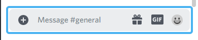
An example of the SearchBar defined above, with a FocusRing rendered around the entire container.
FocusRingScope
FocusRingScope is the mediator for actually rendering rings. As mentioned before, rings can't just be rendered at a single root of the DOM and instead have to be contained to smaller parts of the page (like scrollable areas or absolutely-positioned containers). The Scope declares the roots of those sections, where the nearest Scope in the ancestry of a Ring will be responsible for rendering it into the DOM.
This accommodates those situations where some elements might be partially occluded or scrolled out of the viewport and the rendered ring should respect those boundaries. All that’s required by the Scope is a reference to a container element, which it uses to calculate the position for the ring that it renders.
Internally, these components communicate through a context, where the FocusRing provides the context with an element to render a ring around, which then calculates position and style properties, and finally FocusRingScope subscribes so that it gets updated whenever the target changes.
The only additional thing to remember is to include a FocusRingScope at the root of your app. Otherwise, rings won't have anywhere to be rendered by default.
Remaining Challenges
Even with this approach, there are still a few problems that don’t have particularly clean solutions. We’ve managed to work around them all so far, but these are places where even a custom implementation runs into current browser limitations.
The good news is that at least some of these problems have proposed native solutions. It’s just a matter of time until they gain official support and then we’ll be able to swap them out.
Keeping up with animations
Transitions, transformations, and animations are a big part of modern web design. They provide affordances to help guide users and attract attention to important parts of the page, and generally just feel good when they’re done right.
But when something moves around on the page, it’s surprisingly hard to know where it actually is at any given time, or if it’s even moving at all.
Example of a Focus Ring not keeping up to date with the moving target element’s position.
Since we’re not rendering directly inline with the elements, we can’t just expect the animations to carry our ring along with them. Most of these work directly on individual elements, meaning only that element and its descendants are affected by the changes. Instead, we pretty much have to query the DOM for the new position of the element on every frame and re-render the ring accordingly.
Doing something on every frame is not ideal. We can at least use requestAnimationFrame to make sure that updates are scheduled appropriately and avoid re-rendering when positions haven't changed, but the end result is unavoidably a constant loop that queries the DOM on every frame. We explored reducing the overhead of this by listening to animationstart and animationend events and only running the loop between those times, but because of how events and transforms the bubble through the DOM, it's not always guaranteed to update properly.
What we really want from browsers here is a way of knowing when the layout of an element has changed and running a callback at that time. requestAnimationFrame lets you say something like "I'm going to change something on the next frame", but you can't currently do the inverse and say “let me know when something will be changing on the next frame” to be able to listen for those changes natively. Something like window.onAnimationFrame would be a wonderful addition here. However, it doesn’t currently look like there are any proposals for this kind of hook, meaning a real solution is unlikely to come any time soon.
Our implementation works pretty well now, but there are still occasionally some lagged frames that would be nice to get rid of. For now, the result is still solid and it doesn’t seem possible to do much better.
Example of a focus ring that nearly keeps up with an animation.
Adaptive shapes
One of the original problems we called out about using a standard outline in CSS is that it is extremely limited in how you can customize it. While the shorthand looks a lot like border, you can't actually set an outline-radius or anything to adjust the offset of the outline from the element.
Luckily, we’re not relying on those properties at all here. Since we’re explicitly rendering a distinct element to show the ring, we can do anything we want. But, that also means that we don’t inherit any of these properties from the target element either. Specifically, an accurate border-radius is one of the key things that makes the focus ring feel tight and properly integrated with the elements on the page. For example, a ring with a 4px radius would look out of place around a button with more rounded corners:
Making this kind of adjustment turned out to be surprisingly simple. We already have the target element in the context, so while we’re querying for the position, we can also inspect the style of the element and pick up whatever radius it has set. Then, using some CSS custom properties, it can automatically adapt every time.
Even better, the value returned by getComputedStyle will give the full shorthand value in case the radius is different for any individual sides of the element, so what might seem like weird cases will actually get handled by default, with no overhead for users to worry about. We can easily expand this same functionality to other properties like z-index in case an element is absolutely positioned, or for anything else in the future.
This isn’t a problem that necessarily has a better solution. It’d be nice if outline had a corresponding outline-radius property or inherited from border-radius, but it wouldn't actually be usable in this case because of all the other problems with :focus and outline. Any amount of additional control would always be welcome.
Adaptive colors
One of the last things we wanted to do was make sure that the focus ring that gets rendered is sufficiently visible on top of whatever background the target element is sitting on.
For example, Discord often uses different colored backgrounds on user profiles to represent different statuses like playing a game, streaming, or listening to music. These colors don’t always play well with the default blue that we’re using for rings throughout the rest of the app.
Instead, we want to be able to change the ring’s color to something like a translucent white, which is consistently visible and doesn’t visually clash with the background color.
At a glance, this seems straightforward enough to implement: just like border-radius and z-index from earlier, we can just query the element and set a CSS property in response to whatever we find, right? But, at least in browsers today, there isn't a direct way to get the background color that an element is sitting on. You can find an element's background-color, but that's not the same thing. And just looking at the FocusRingScope container's background misses any cases where someone might just render a div with a background somewhere in between the ring and the scope.
Thankfully there is still a way to do this, though it’s neither pretty nor efficient. The only currently-available way to accurately get the color behind an element is to manually traverse all of the ancestor elements and check their background colors. Even then, you have to do some math to composite the colors together in case there’s any opacity in them. The efficiency of this approach depends on how complicated and deep the target element’s DOM subtree is.
Depending on how complicated of a DOM structure the element is within, this can be somewhat simple to do, or may involve a few dozen elements and a relatively slow DOM query for each one.
While that’s a workable solution, there may actually be a better way in the near future: There’s a current discussion abouturrentBackgroundColor value to CSS. This would ideally be queryable as well and would skip all of the manual ancestor traversal that is currently required. And another suggested feature in the CSS Color Level 5 draft is the color-contrast function, which would let authors specify a list of colors and have the browser automatically pick the most visible color.
The Future
We only covered one small (but certainly not trivial) aspect of our entire Keyboard Navigation project here. While our primary goal was just to integrate keyboard navigation into the existing app, we also wanted to make sure we could maintain that baseline in the future and avoid most regressions as the app grows and evolves with time.
All told, there were a number of other challenges that we had to solve, each with their own complications. Just a few examples of that additional work include creating new systems for automatically managing focus throughout the entire app, redesigning legacy features to make sure they can support proper semantics, and refactoring many of our core UI components to make sure they work with keyboards by default.
While many of the situations we encountered were complicated, they generally had solutions that came about naturally. Focus Rings, though, presented a unique challenge where every simple solution failed to meet our requirements for quality and effectiveness. We exhausted all of the functionality that browsers currently provide natively and ended up having to build our own solution from scratch.
Through all of this work, though, we learned a lot about the problem space for focus rings and potential ways that browsers could make this easier for everyone in the future. We’ve had some passing conversations about some of these problems with browser vendors already, and are hoping to see a collaborative effort with vendors and spec authors to turn these ideas into a real standard.
In the meantime, if you’d like to see the nitty-gritty about how we actually solved these problems, or if you’re in need of a consistent focus ring for your own application, we’ve released all of the code as an open-source package!
You can check that out on GitHub here.
Keyboard navigation is a fundamental part of creating accessible experiences that everyone can enjoy, and we’re delighted to finally bring a complete, high-quality implementation into Discord. This is a project that touches every part of the app and creates an entirely new way for people to interact with it.
We’re excited to see how users of all kinds can take advantage of this new way of navigating and are looking forward to future projects that will help us make Discord more accessible, more inclusive, and more available as the place to talk for everyone, regardless of their situation or abilities.


.png)
.png)


Nameplates_BlogBanner_AB_FINAL_V1.png)

_Blog_Banner_Static_Final_1800x720.png)


_MKT_01_Blog%20Banner_Full.jpg)


.png)


