Discord
Tags

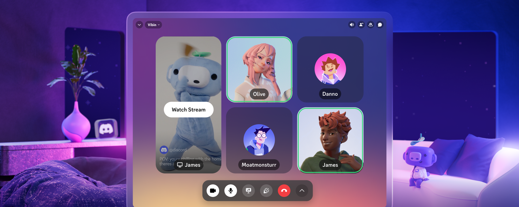
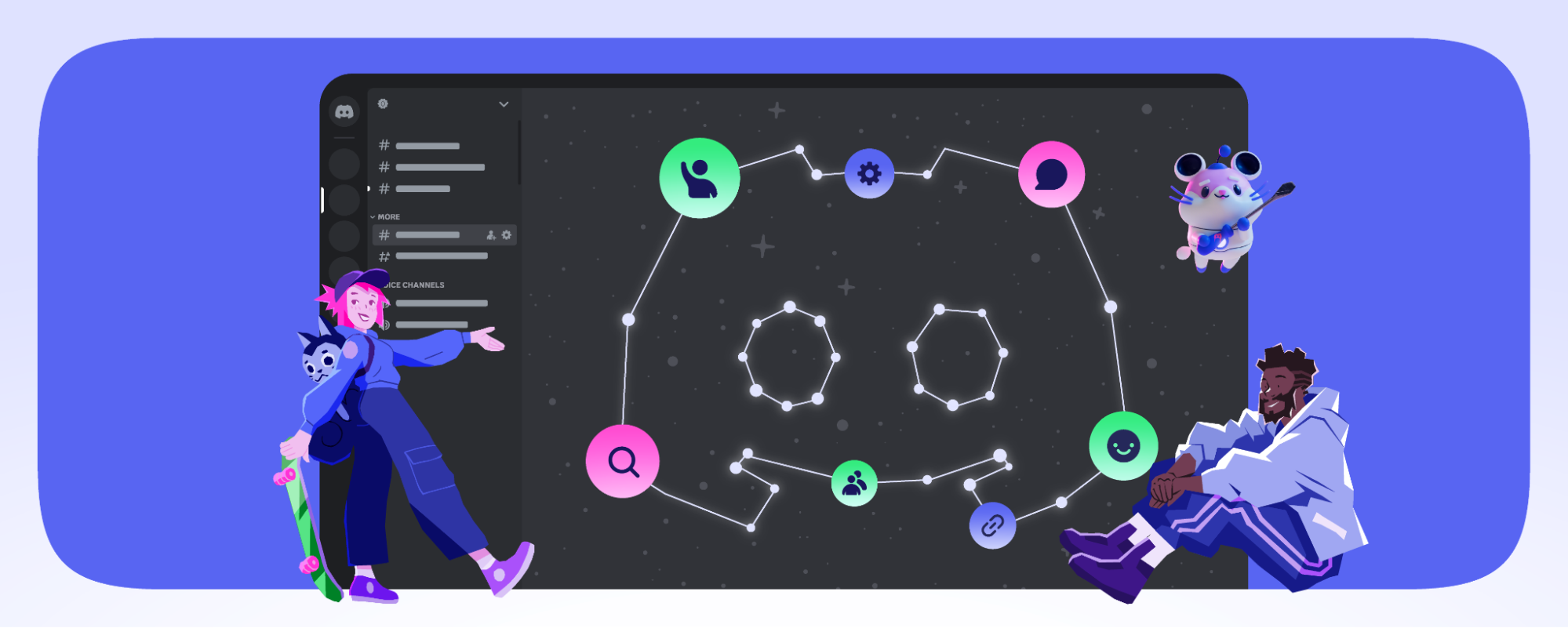
Late last year, we rebuilt our mobile app to help make talking with your friends way faster, way smoother, and way easier. The UI was streamlined to help you see what they’re up to, start or join group chats faster, and we even added new ways to make Discord your own (you’re finally official, OLED theme!). 

It’s been a few months since then, and we’ve been collecting all your feedback about the new mobile app and taking all your sentiments to heart. There’s… a lot of feedback — shoutout to the tabletop shop employee who saw my Discord staff hoodie, powerwalked up, and immediately brought up the mobile app. 

With your feedback and ideas, we’ve been working on new updates to the mobile app based on your experience now that it’s been out for a few months. Today, we’d like to share a few updates to the mobile app in regards to Search and Tab Navigation, along with improved Accessibility and Performance.

We Moved Servers and DMs Back Into One Spot Again

When we launched the new mobile redesign, we separated Servers and DMs into dedicated tabs in the hopes that it would let you reach your friends and communities faster. 

Over time, we heard consistent feedback that it makes it hard to mentally switch between mobile and desktop. Splitting Servers and DMs apart on mobile meant the people and places you care about live in different areas than they do on desktop! 

A preview of the new merged "Home" tab. It now includes both servers and DMs in one place.

We’ve decided to fuse the Servers and Messages tabs back together into one, letting you see which of your friends are DMing you while you’re exploring the channels of your favorite servers. We know some of you may have gotten used to DMs and Servers split out — lots of us internally got used to it, too! 

However, the overarching feedback about confusing navigation when Servers and Friends are separated is loud and clear. We want to make sure navigating to your important people and places on Discord feels consistent across all platforms Discord is on, whether you’re on desktop or mobile. 

We Added Additional Search Filters on Mobile

In our new mobile app, we gave Search a fresh new look that lets you more easily sift through messages, media, pins, and links in any channel or DM you’re looking at. But we also heard that you’d like to be able to search within a server starting from any channel, and finding the right search filters could be difficult… which is the opposite of how settings for a Search function should be, ya know? 

Three side-by-side images demonstrating the new search filters and improved functionality.

So, we added in-line prompts as you start to type out common filters. You can even remove the default “in: #channel” filter and search the whole server if you want! 

We also heard it was hard to tell who sent a message, which makes it difficult to see who said “hey” in chat on a particular day. We improved how search results show the author of the message. 

We Brought Desktop’s Saturation Slider to Mobile

…and we added a new Contrast slider, too! When we refreshed our mobile app we made the default Dark theme a wee bit darker and added the fabled battery-saving Midnight/OLED theme to all platforms. Finally, no more having to tap the Dark theme setting repeatedly to unlock it.

A screenshot of the new Contrast and Saturation sliders in the Accessibility section of the User Settings page.

Some users reported that they struggled due to the increased contrast and saturation in mobile’s new themes, so we added Saturation and Contrast controls in our Accessibility settings. These sliders affect not only the theme itself but also elements such as button colors and in-app notification dots.

Choose your favorite theme and use the new Contrast & Saturation sliders to make Discord work best for your eyes.  

We’re Improving Its Performance

We’ve done a lot to make our mobile app even better over the last few months, such as shortening the time Discord takes to load on lower-memory devices and incorporating everything listed on our mobile webpage… and as you’ve read today, we’re not stopping! 

Our Engineering team has started a new Patch Notes series where their team details what they’re doing to make Discord better on mobile AND desktop. Check out their first edition of Patch Notes here to see everything that's been improved recently

Making Discord the best it can be is an ongoing task, and we’ll keep listening to your feedback on what works and what could use a little fine-polishing. 

And We’ll Keep Listening To Your Feedback

Last but not least: we’re working on reintroducing a “Swipe to View Member List” gesture to replace the existing Swipe to Reply gesture. If you still like to “Swipe to Reply,” we’re planning to release an optional setting to let you keep swiping to reply to your friends. 

These changes were made because many of you let us know what was great about the new mobile app, and what could use a second look. Have feedback of your own? We’re all ears. And eyes. And maybe a nose or two. Hop over to our Feedback Forums and let us know what you think could use a tune-up. There’s a dedicated Mobile section in the Feedback Forums, or you can add ideas for any aspect of Discord you can think of.

THE AUTHOR
MORE FROM