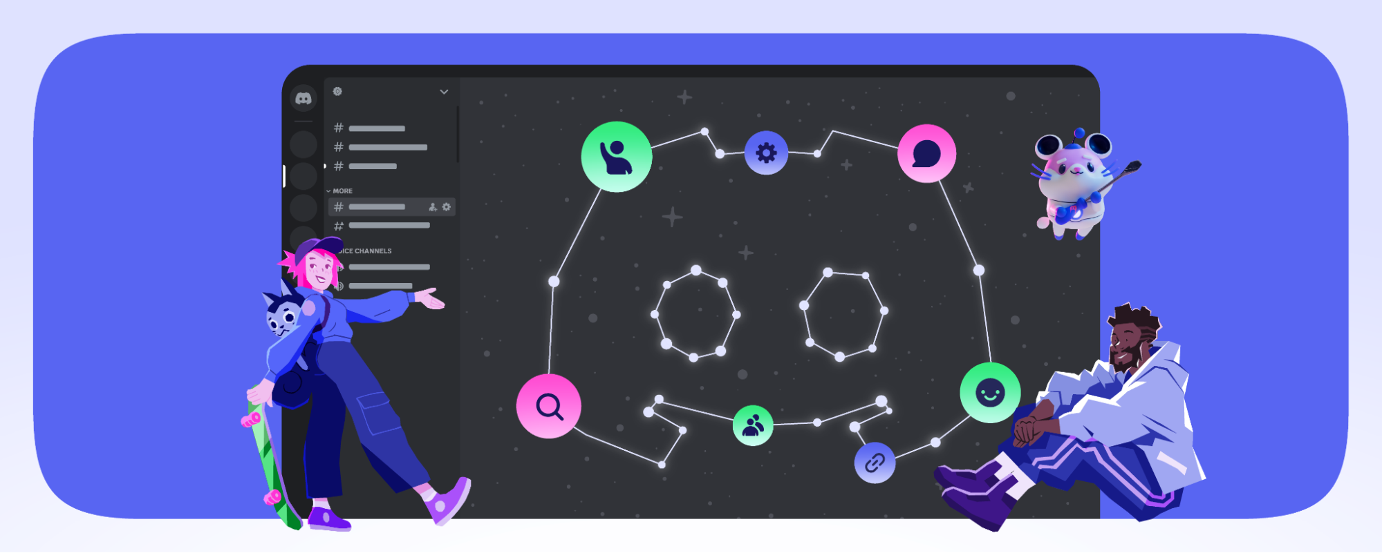
“Take the Discord you know and love, squish it down to the size of a phone, and take it with you anywhere” — that’s the gist of how the Discord mobile app has worked since its release in 2015. Back then, our focus was on building great products for people who play games on PC, with mobile serving as a companion app for when you were AFK.
Over time, the amount of *stuff* that Discord can do has grown exponentially. And yet, the mobile app was forced to just shove it all in a tiiiny version of the desktop app. The world has also changed — as more of you spent time using Discord on the go, what was lacking on mobile became more apparent. It was missing standard features that people have come to expect from using other mobile messaging and communication apps and had speed and reliability issues.
So about a year ago, we started a team to tackle an important mission: build a better mobile app. Our first order of business? Adding an easter egg, obviously. We added a new experimental build, accessed by tapping and holding on the ✨ sparkle emoji in any chat on mobile.
As we built, we listened to the ✨ sparks of feedback that came via mobile app reviews, X, and in-app surveys from those who got to try it out early. And thanks to your feedback, we implemented many highly-requested improvements like adding global DM search, simplifying media sharing, reducing app-open time by 43% on iOS and 55% on Android, and letting you access more messages when offline. We also experimented with some more controversial changes, like a re-envisioned server tab with more customization options, and a dock to pin your servers. Some of those ideas worked, and others weren’t as well received (yes… we also read Reddit).
Starting today we’re excited to share that “Discord but smol” is evolving so that you can take advantage of what makes your phone so great. Rather than retrofitting designs meant for mice and keyboards, it’s a fresh look intended for the touchscreen that fits in your pocket. It’s a faster, more reliable app than before, with new features that help you and your friends chat and hang out on the go, like voice messages, and a 25 MB free file upload limit. And most importantly, this time we designed mobile as its own independent experience — as something you can use as your main Discord app when you’re on the go, not as something you use alongside the desktop app.
I’m excited to share with you today where we landed, what we learned, and what’s next for Discord on mobile.
The first thing you’ll notice when you launch the updated mobile experience is a set of new Navigation Tabs on the bottom. They’re there to help you get to what’s most important: your conversations. Specifically, Servers and Messages now live in separate tabs.
What was once hidden behind a sliding motion is now front-and-center — the moment you open the app, your Servers, Messages, Notifications, and the You tab are accessible.
Servers
Earlier this year, we began experimenting with a revamped layout for navigating your servers. One of our ideas was to display your servers horizontally in a dock, similar to your phone’s home screen. We also tinkered with how the channel list looked, adding message previews, emojis to represent each channel, and more padding between them. But as we tested these changes, we heard feedback from you:
While the horizontal layout of servers was more familiar and closer to your thumb, it made fewer servers visible at once, which was a pain for those chatting in more than a handful of servers.
Although additional customization options in the channel list made the server feel more personal and alive, they also collectively made the tab feel more cluttered and harder to scan at a glance.
Keeping your feedback in mind, we went back to the drawing board to find ways to organize your chats without making the app feel harder to use. The design we are bringing to users today still separates Servers and Messages into different tabs but retains the vertical server navigation you’ve grown used to. Behold:
Of course, we’re not done there. We’ll continue iterating on the new Servers tab to make it more ergonomic without losing quick access to servers and customizable without feeling overwhelming. We’ll also explore ways to give you more visibility into what your server pals are doing so it’s easier for you to jump in and hang out.
Messages
All your Direct Messages (DMs) and Group Direct Messages (GDMs) now live here. Above your conversations, you can see what all your friends are doing at the moment, whether they’re in a voice channel together, playing a game or Activity, or just listening to something on Spotify. You can also favorite specific DMs or GDMs so they’ll always appear at the top of your Messages tab.
We’ve supercharged search so you can scour through all of your messages, pins, files, and attachments, and pinned messages, straight from the Search bar. You no longer have to search for a particular pinned message in each DM individually — one search bar looks through it all!
We gave some much-needed attention to the Channel and G/DM Detail pages to let you find what you need in the chat faster. Quickly see every member, shared media, links, pins, and more from a single location. Find something specific using Search, or scroll through memory lane in the Media tab.
Gone are the days of creating a new Group DM every time you want to chat with the same 3 people. We made it faster and easier to create a Group DM, and if you happen to already have one with the same combination of friends, we’ll let you know!
In addition to long-pressing on a message to reply to it, you cannowquickly Swipe to Reply to any message posted in chat. It’s perfect for immediately typing “alksdjka;alsjdkklfa” after a hot take that’s flat-out incorrect. Previously, swiping from right to left across a channel or G/DM would take you to see the details of that chat, aka the member list. We are currently working on ways to add quick access to the member list, and in the meantime, you can tap on the name of the G/DM or channel at the top of the screen to access the member list.
Notifications
Anytime something new happens, you can jump here to stay up to date on all the times you’ve been @mentioned, just like before. In addition to @mentions, any Server Events, updates on Friend Requests, and replies to your messages will show up here.
Best of all, every notification is actionable: tap a @mention, and you’ll go straight to where it was posted. New friend accepted your request? Tap that notification and you’ll be brought to your DM with them. Server event started? Tap that to jump to the server the event is taking place in. To sum it up, the Notifications tab works like this: If anything pops up there, you can do something with it.
We also made it so that notifications auto-clear as soon as you read them so you don’t have to waste time tapping to clear them.
You
Represented by your picture-perfect profile icon (lookin’ great, btw), the You tab is where you’ll be able to see what your profile looks like at any time. Change your profile and status, upload a new profile icon, access your account settings, and find your friends list right here. If you want to get to settings quickly, you can also double-tap the You tab icon at the bottom of the screen.
Plus, if you need to get a particular setting at any time, the User Settings page now has a search bar! Perfect for when you know exactly what you want to adjust but aren’t sure where to find it.
Midnight Theme
Because you asked (and asked, and asked), we created a new Midnight theme, which is pure black to save your battery and your eyes. Everyone can freely utilize the new Midnight theme, where chat spaces will be on fully-black backgrounds — great for saving a little bit of battery on smartphones with OLED screens. We weren’t leaving you in the dark about it, we brought the dark to YOU.
Better Media Sharing
Now your #travel-pics channel can go big. With the improvements we made earlier this year to media sharing, you can select even more pics and videos at once, even the high-quality ones (up to 25 MB), and upload away. Fellow explorers can view it in a neatly organized grid and swipe between uploads while seeing the cool panda fact message you sent along. Preview exactly what image you’re attaching to your messages without having to do one first before the other.
When you add multiple images to your message, they’ll be organized in a gallery-style view instead of embedding in their full size — gone are the days of scrolling for hours because your friend decided to share two phone screenshots with every message they sent.
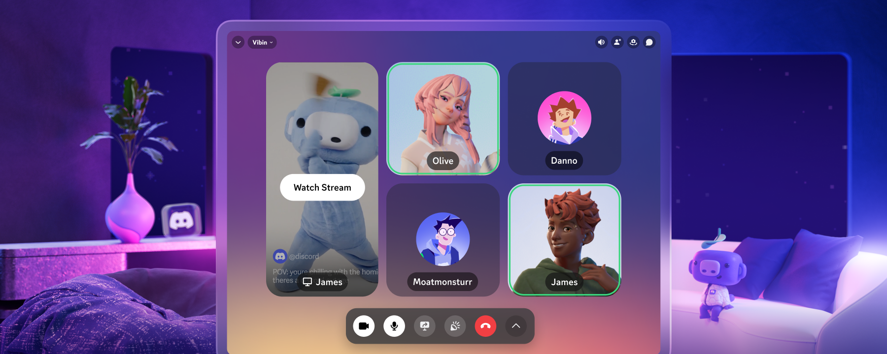
Voice & Video UI
We also updated the UI on voice and video calls to make the space more cozy for you and your friends. Now you can all enjoy a more comfortable virtual call with more intuitive interactions when you’re on the go.
So Fast, So Smooth
None of this would matter if the app didn’t excel at what’s most important: getting you to your conversations faster. So yeah, it’s faster. Much faster.
How much faster? We’ve reduced app open time by 55% on Android and 43% on iOS. When hopping between channels and chats, the mobile app now uses 4 timesless data when loading up for the first time, and keeps your most recent messages cached in the background. We also cut the crash rate in half this year for Android users. PROGRESS!!!
When you’re hopping between conversations in your servers and DMs, the mobile app will now store the recent messages of up to 700 text channels and DMs, letting them load quicker as you navigate your communities. Scrolling up and down channels to catch up on the conversation is better as well, with background improvements that let you scroll faster, without having to wait for things to “buffer.”
So Update Your App and See What’s New Today!
With more ways to find your stuff and customize your experience, plus countless performance improvements, Discord on your phone is about to be better. We couldn’t have made it as great as it is without the feedback of those who tried it out early, so to those who took the time to submit their feedback: thank you.
And we’re not done yet! Now that these improvements are available to all users, it’s time to say “adiós” to the ✨ sparkle emoji and begin addressing additional improvements that you’ve asked for, including:
Adding quick access to the member list for a server
Providing even better search filters so you can find what you’re looking for faster
Giving you more control over how compact lists and messages appear across your app
Continually improving the performance and stability of our app so you can spend more time connecting with your friends on the go
Want a more comprehensive overview of our latest updates, complete with a dancing wumpus? You can see everything that’s new at discord.com/mobile, or check out our Help Center article!
And just because the ✨ sparkle emoji shortcut is gone doesn’t mean you can’t help give us another spark of inspiration — if you want to give any feedback or ideas and prefer trying it out on your desktop, hop on over to our Feedback Forum or send us a “post” on the platform formerly known as Twitter.
Tags
No items found.
Francesco Polizzi
Group Product Manager & Wumpus aficionado at Discord.


.png)
.png)


Nameplates_BlogBanner_AB_FINAL_V1.png)

_Blog_Banner_Static_Final_1800x720.png)


_MKT_01_Blog%20Banner_Full.jpg)


.png)


