


You’re waiting for your multiplayer match to start, or maybe you’re entering the boss room when you hear the Discord notification sound.
Now you’re faced with choices: You could ignore the notification, which the enticing *bloo-bloop* makes impossible, stop everything you’re doing and go buy a second monitor, or spend several seconds alt-tabbing to Discord to read it, and then several seconds alt-tabbing back into your game.
Regardless of what you choose, this isn’t an enjoyable experience and it’s one of many problems we solve in our Discord overlay redesign.
Hold on, what’s an overlay?
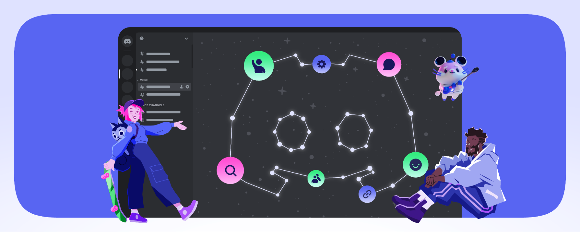
For those unfamiliar with in-game overlays, they’re a “layer” of features — usually chat, a friends list, etc. — that can be accessed without needing to alt-tab and losing focus of a game. Overlays are usually accessed via a hotkey (our default hotkey is shift +~) while a game is running.

The original overlay
The original overlay we released in 2016 was designed around voice activity. If you and your friends were in a Discord voice channel, the overlay would display you and your friend’s avatars in-game.


This feature worked well for switching voice channels, seeing who was talking, or knowing which of your friends left their microphone unmuted (I’m looking at you, Siegfried).
While this focus on voice features was useful, we wanted to make the overlay useable for Discord’s other core features.
About the design process
The Discord design team’s process generally follows the:
This process can be broken down into four phases: discover, define, develop, and deliver.
Discover
In order to define what a valuable overlay experience might look like, we set aside additional time for discovery during our design process. During this period, we interviewed both overlay and non-overlay users. We read through our feedback board, played games with our existing overlay, camped in the woods for three days, and spent time brainstorming ideas to bring to our discovery meetings.
During this discovery period, we learned a lot about ourselves, our hopes, dreams, and fears. Figured some stuff out about the overlay too:
We discovered
- We should provide benefits to users for every type of game. This includes single player, multiplayer, or massively multiplayer.
- Performance of the overlay is a critical part of the experience. If the overlay drops a game’s performance, isn’t reliable, or doesn’t resemble the desktop app, then users won’t want to use it. And who could blame them?
- Use existing design language wherever it makes sense. If we have an existing design component or familiar flow from the desktop app we should leverage it as long as there isn’t a better contextual replacement.
- Text chat within the overlay is something everyone wants. It provides the opportunity to improve engagement, match the desktop experience more closely, and lets us introduce new features unique to the overlay.
- Camping is a bad place to realize you’re afraid of the dark. Not all self-discovery is good.
- Reduce friction for main use cases. The actions the majority of our users will be utilizing the overlay for should be simple, familiar, and obvious. These actions include join voice channel, respond to a direct message, and accept an invite.
- Provide an experience that mimics the joy of using the desktop app. We should aim to include all of the quality of life and fun features of the desktop app whenever possible. It shouldn’t feel like a different product. More like we grew a third arm and we give amazing hugs now.
Define
Our projects at Discord start with a product spec. This document describes what we’re building, who we’re building it for, and the outcome we want to achieve. This process is collaborative, the entire product team — both engineering and design — can weigh in on all aspects of the project.
In the case of our overlay redesign, our discovery phase helped further define the product spec. We updated the spec, reprioritized features, and set scope so the team was aligned before starting development.
Develop: challenges of designing an overlay
Before opening up a design program we started sketching and whiteboarding ideas. The sketches are quick and fairly rough so instead of sharing those, I’ll share the designs that were created from those sketches.

Don’t obscure the game entirely
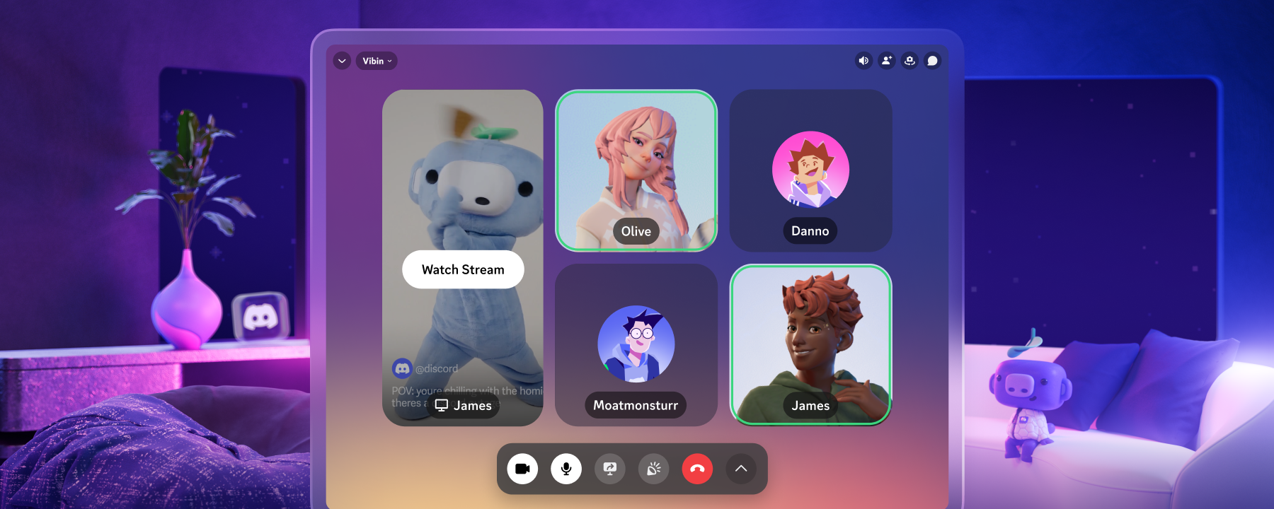
Overlays have two states: active and inactive.
While active, the overlay interface is on top of the game and the features are made available. This should not prevent the user from seeing their game. Being able to follow what’s happening in case they need to switch back to playing is important to the experience.
One design decision that we made early on was the transparent color layer that would appear when the overlay was active. This layer provided contrast against the game making the UI easier to see and the inactive/active states more distinct.
When the overlay is inactive, the user just sees the game they’re playing.
Don’t reinvent the wheel to integrate text chat
In the earliest designs, we explored how text chat could work without copying the client directly.


I found myself gravitating back towards the app’s convention of servers stacked vertically. Horizontally displaying recent conversations was far too limiting and felt like change for the sake of change.

As we explored alternative designs for text chat we quickly realized the benefits of leveraging our existing conventions. By borrowing from our desktop app, we could avoid having to reeducate users and could reduce cognitive load.
No two game interfaces are the same
Game interfaces come in all shapes and sizes and the features of the overlay needed to accommodate this. This meant the user needs full control of the size and placement of both voice and text features.
With the addition of text chat within the overlay, we realized not all overlay users would need to see voice activity, which was the only functionality it provided previously.

From this realization came the idea of widgets.
Widgets were windowed features that could be moved around, resized, shown in game, or hidden from view. The thinking behind this system was to give the user control of positioning, while also encapsulating all the settings and controls of the feature within the widget.

Early on we had a widget design for every piece of the overlay.
We performed several sessions of user testing to help refine the widget designs and interactions. Through user feedback, we were able to simplify flows, improve widget controls, and create a solid design system for the future of the product.

Custom cursors override default cursors
Most AAA games have custom cursors for their titles. This problem informed the design of our widgets. This meant the user wouldn’t see traditional cursor changes that would signify something was draggable or resizable.

Instead, we needed to present these actions with icons, tooltips, and give the icons a hover state in order to feedback to the user.

Users need to see messages
As I mentioned previously, hearing a notification but not knowing who or what was being sent was not an enjoyable experience. The way we solved this problem was with in-game notifications.
Notifications are something that all games benefit from. Playing a single player game and receive a direct message? We show you a preview in-game so you can decide to respond. Or ignore it. Probably ignore (sorry Siegfried).

The notification system design was based on our message component. The design consists of an avatar, a title, and a message. At a glance, you can immediately recognize the sender and enough text to provide context.
We also use our notification system to display updates to the overlay, sort of like a tiny change log. In order to reuse the component, we change the background color and replace the message content with a footer that can also house controls or the hotkey shortcut reminder.

To give users more control of the interface, we created settings for in-game notification placement and the option to disable them entirely.

Users need access to their communities while playing
Discord’s goal is to bring people together around games. So, while we all love to be immersed in a game from time to time, there’s also plenty of instances where you want to still be involved with your server while gaming.
In order to address this issue, we came up with the concept of pinning. Pinning is when the user wants to display that widget in their game.
With pinning, users could make any game a social one. Whether users were completing daily quests in World of Warcraft, or playing a rogue-like to kill time, now they could do so while still interacting with their server.
Pinning widgets provided a consistent way of showing, or hiding, voice and text activity.

Deliver and Results

Once we released the redesign and enabled more games to use in our overlay we saw a 50% increase in overlay users. Of that group, 30% use text and notification features.
More importantly, the redesign gave our team a solid foundation to keep building upon. So while the release was a great first step to improving our overlay experience, it also gives us room to improve in the future!
Thank you to the team
It’s hard to articulate how important collaboration and teamwork was in order for this project to be successful. I’d like to say thank you to everyone here at Discord who contributed to building the overlay.
We’re always looking for the next great addition to our product team at Discord. If you are passionate about design and user experiences, and hate camping, hit us up at jobs@discordapp.com.


.png)
.png)


Nameplates_BlogBanner_AB_FINAL_V1.png)

_Blog_Banner_Static_Final_1800x720.png)


_MKT_01_Blog%20Banner_Full.jpg)


.png)


